Selected logos and wordmarks.
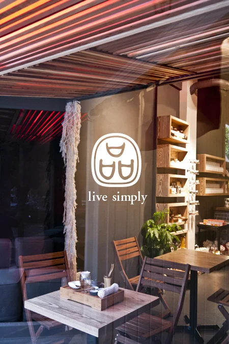
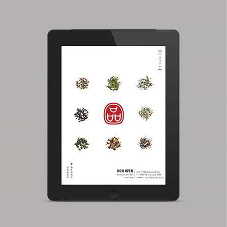
Taste is a complete branding and interior design project for an urban Chinese tea café and shop in Hayes Valley, San Francisco. The objective was to introduce the traditions of Chinese tea and lifestyle into the contemporary city by way of subtle sensory design elements.
In collaboration with interior and lighting designer Andrea Faucett, design choices on all scales were taken into careful consideration. Name choice and application, interior layout and circulation, product display, packaging design, sound, lighting and material details flow seamlessly and curiously together to create an experience of calm and relaxation. It is a place to slow down and explore for the tea novice and an oasis for the enthusiast.
Interior design by Andrea Faucett
Levi's Spring 2014 // Denim Guide
The lookbook is designed with a minimalistic approach and hidden gatefold pages as a surprise element to highlight this season's products.
Photographer: Matthew Wright
Copywriter: Mia Harlock
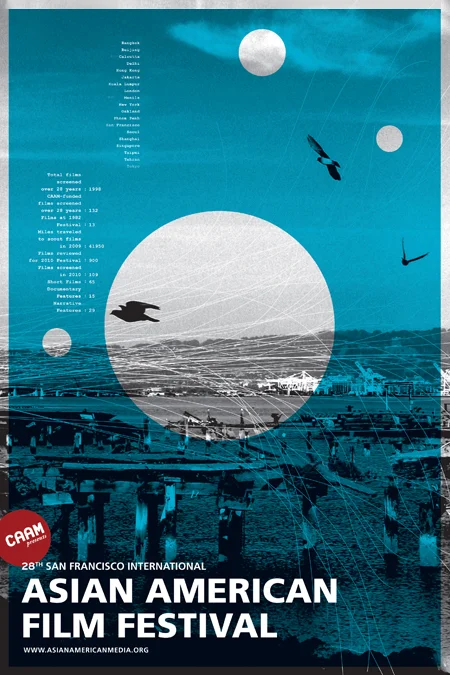
The Center for Asian America Media presents the San Francisco International Asian American Film Festival (SFIAAFF) every March. The SFIAAFF is the nation’s largest showcase for new Asian American and Asian films, annually presenting approximately 120 works in the Bay Area.
For the 28th campaign, the folks at Noon and I gathered some fun facts and datas from the past 27 years of the festival to highlight the growth of the organization. Combining the statistics with photographic images, we created a fun and informative campaign.
Designed at Noon.
During my time as the design director at TCHO, I worked closely with the design team to develop the new look and feel for the new products, also redesigned various packagings, website, and signage. Brand originally designed by edenspiekermann.
Please scroll down to see the range of projects that I've lead.
Here's a list of awesome people that I've collaborated with along the way:
Richard Richards
Andrea Faucett
Elina Frumerman
Suzanne Baxter
Janet Lai
Emy Joyuex
As part of the new identity development, I've worked on the relaunch of TCHO's website. In collaboration with Ari Salomon, Brian Holecko along with the design team, we created a site with an extensive back-end system for content management as well as e-commerce development.
Website developer and project manager: Ari Salomon
Software engineering and e-commerce developer: Brian Holecko
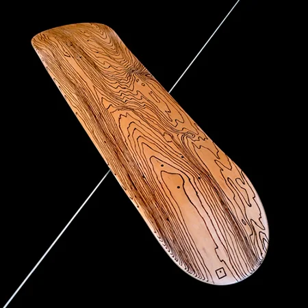
"Based on the idea of coaxing the graphics out of the material itself, the deck suggests how skateboarding embodies an acute relationship to surfaces and the enjoyment of urban landscapes. With a handy burning tool, we traced the wood’s natural veins, providing a contour effect typical of topographical maps."—Noon
Hand burned at Noon.
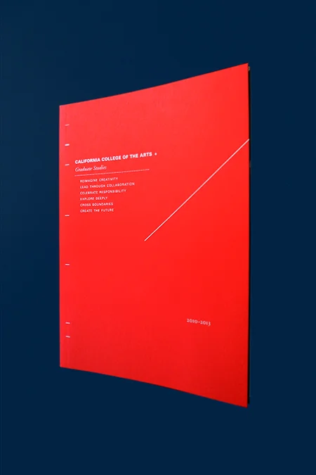
A view book designed for the California College of the Arts graduate programs 2010-2013.
Designed at Noon
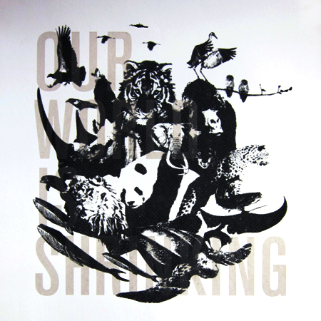
"Featuring some of world’s most endangered species, it carries the rather alarming statistic that we’re heading towards an extinction at a rate of about one every 20 minutes and in that same time, worldwide we will destroy 1,200 acres of forest and emit 180,000 tons of carbon dioxide into the atmosphere."—Noon
This 22" x 30" four-color (plus varnish) hand pulled screenprint poster is printed in a limited editions of just 25.
The poster was designed at Noon and hand printed at the Levi's Print Workshop in San Francisco.
Taste is a complete branding and interior design project for an urban Chinese tea café and shop in the heart of San Francisco. The objective was to introduce the traditions of Chinese tea and lifestyle into the contemporary city by way of subtle sensory design elements.
Client: Taste
Developer: Mike Hu
Congrats to Irene and David! The dear friends of mine tied the knot this summer. It was an honor to design their wedding invitation and website.
These letterpress coasters were printed at Logos Graphics in the Mission district, San Francisco.
Identity, stationary system and signage designed for the Emergence Healing Arts Studio in the Castro neighborhood, San Francisco. The logo communicates the idea of a nest, it's safe and nurturing. A place to promote a peaceful and healthy life style.
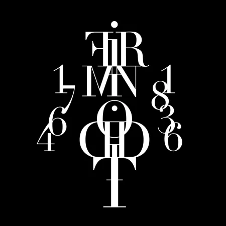
This accordion fold-out booklet was designed to celebrate the type designer, Firmin Didot. Didot created the classic typeface after his name, Didot. Based on the elegant structure of the typeface, I've created a word mark and various compositions throughout the booklet.
The brochure was designed under the guidance of Angie Wang at the California College of the Arts.
In conjunction with Double Down: Two Visions of Vegas, SFMOMA has commissioned a limited-edition double deck of cards. A “day” deck tracks the arrival of animals from the desert, while a companion “night” deck finds people on the reverse journey. The decks are designed so that each hand dealt tells a distinctive story.
I worked as a designer, illustrator and photographer under the art direction of Martin Venezky at Appetite Engineers.
This project is now part of the SFMOMA permanent collections.
Client: SFMOMA
Curator: Henry Urbach
Author: Michael Cunningham
Designed at Appetite Engineers
The book was written and designed to celebrate some of the most mundane objects that we use in our daily life. Most of these objects are tools that we often used to grimy things, such as plunger. I used photography as a tool to transform these objects into something larger than life, something that consider as beautiful according to the ancient philosopher. This book is a celebration of our ordinary objects.
A series of 26 screen printed posters designed for the California College of the Arts’ lecture series, Micah Hahn. In collaboration with Harrison Pollock, we set up a video feedback, and captured 26 unique images. Each image is a record of 2-3 seconds movement of different light sources. We then screen printed the details of the event on top of the oversize printouts.
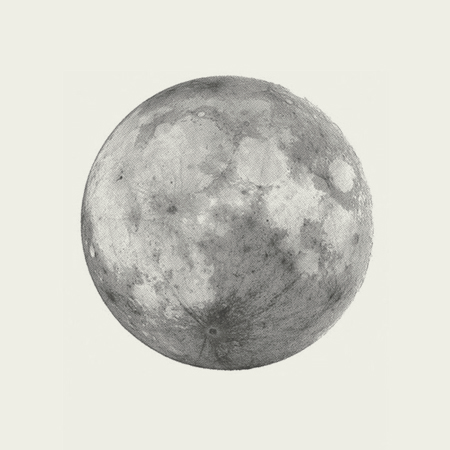
Back in 2010, I was selected as one of the residency screen printers for the first Levi's Pop Up Workshop series in San Francisco. The goal of the workshop was to use printmaking as a vehicle to bring together artists, designers, and local community.
The Moon poster was the last piece that I've designed and printed at the workshop. I've always loved the moon, but for this particular piece, the full moon symbolizes a full circle as the workshop came to an end. Throughout the three months of the workshop, I've collaborated with some amazing local artists, designers, craftsmen and non-profit organizations. It was truly a humble experience to connect, create and teach the local community that I'm a part of through printmaking.
The Moon print was hand printed on 220 lb Mohawk paper, with gray metallic and glow in the dark ink in editions of 50.
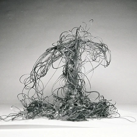
This book accumulates a 5 months long of explorations and experimentations of the properties of different materials. It began with thumbtacks and pencils, the photography-based investigation expanded to other materials include paper and plastic in an attempt to find beautiful and dynamic form in everyday materials.
The San Francisco Museum of Modern Art distribute a bi-monthly newsletter to its members to keep them informed of all museum events. For each issue, a guest artist or designer is invited to design the mailing panel. There are several requirements: it must use the museum's name, their logo, address, indicia, and an area for the recipient address to be printed by a mailing house. I explored a hidden dimension within the panel by creating reflections of that's normally appears on the panel.
An ongoing explorations of typography.